How to implement a Multi-Select Dropdown component with React and Tailwind CSS
There is a newer version of this tutorial:
How to implement a Multi-Select Dropdown component with React and Tailwind 4.
Recently I stumbled upon one of Web Dev Cody's videos where he was implementing a Multi-Select Dropdown component. So, I decided to write my own one, but with a twist — also make it work when JavaScript is disabled 🤓. So I ended up using the Checkbox Hack and the old-school form action attribute. Let walk through the implementation from creating the initial HTML markup to adding some progressive enhancements such as “Select All” and “Clear Selection” buttons if the JavaScript is enabled in the browser.
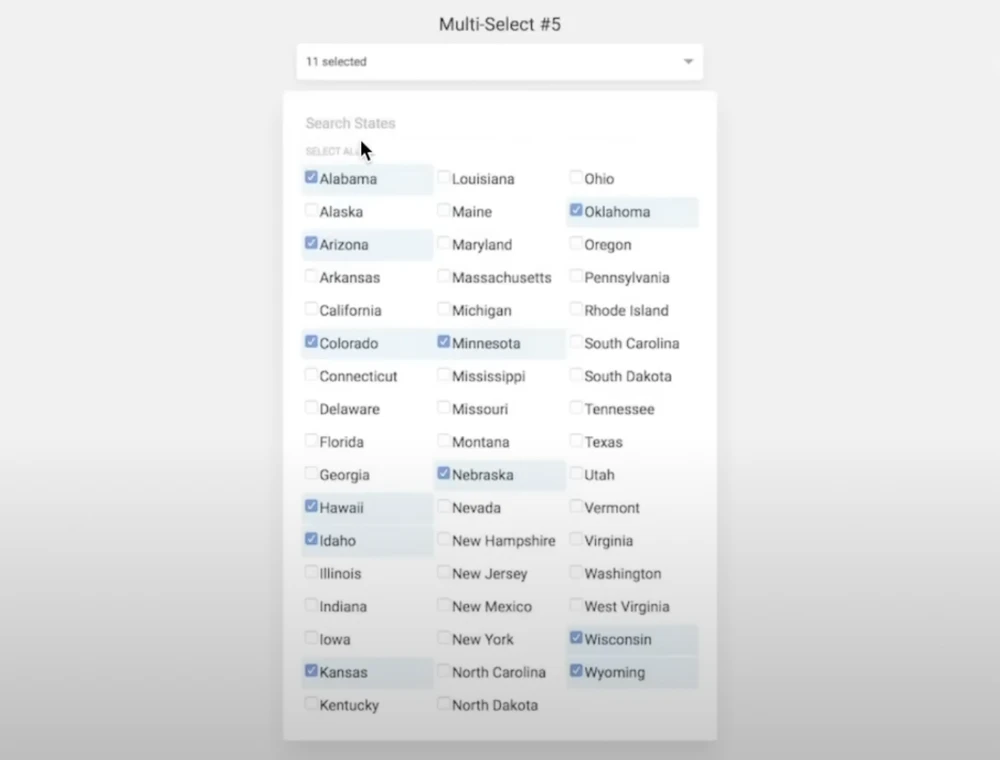
The end result will look like this:

Prerequisites
I’ll skip the boring part such as setting up the project and adding Tailwind CSS to it. Instead, please use the following links as a reference:
I also created a GitHub repository, you can follow from this commit.
The design

As you can see from the image, there are two main parts of the component: the “toggle” (the panel where it says “11 selected”) and the dropdown part with the list of options.
The skeleton
First, create the component in the src/components directory:
// src/components/MultiSelectDropdown.jsx

export default function MultiSelectDropdown() {
  return (
    <label className="relative">
      <input type="checkbox" className="hidden peer" />

      <div className="cursor-pointer after:content-['▼'] after:text-xs after:ml-1">
        {"Show the dropdown"}
      </div>

      <div className="hidden peer-checked:flex absolute bg-white border">
        {"Welcome to the dropdown"}
      </div>
    </label>
  );
}
Here’s the Checkbox Hack. Notice the hidden input of type checkbox. It makes the input invisible, but since it’s enclosed inside a label, any click on the label will flip it’s state. Then, we style the sibling based on the state of the hidden checkbox using the peer and peer-checked:flex classes from Tailwind CSS. Initially the dropdown is hidden, but if the checkbox is checked, the dropdown is going to show up.
I also added a triangle after the “Show the dropdown” text to indicate that this is indeed a dropdown 🙌.
Next, create a page, so that there is a place to display the component:
// src/app/page.js

import MultiSelectDropdown from "../components/MultiSelectDropdown";

export default function Page() {
  return (
    <>
      <h1>{"Multi-Select Dropdown"}</h1>
      <form>
        <MultiSelectDropdown />
        <input type="submit" />
      </form>
    </>
  );
}
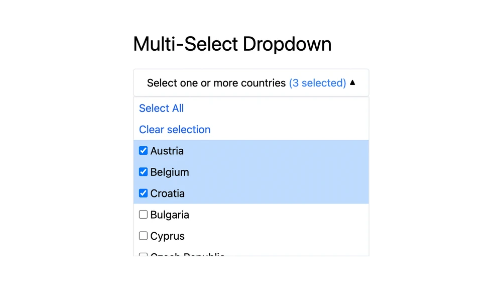
This is what the result so far should look like:
Smooth transitions
This is an optional step 💅. I just added some animations to the dropdown:
// src/components/MultiSelectDropdown.jsx

export default function MultiSelectDropdown() {
  return (
    <label className="relative">
      <input type="checkbox" className="hidden peer" />

      <div className="cursor-pointer after:content-['▼'] after:text-xs after:ml-1 after:inline-flex after:items-center peer-checked:after:-rotate-180 after:transition-transform">
        {"Show the dropdown"}
      </div>

      <div className="absolute bg-white border p-2 transition-opacity opacity-0 pointer-events-none peer-checked:opacity-100 peer-checked:pointer-events-auto">
        {"Welcome to the dropdown"}
      </div>
    </label>
  );
}
For the toggle div I added classes after:inline-flex after:items-center peer-checked:after:-rotate-180 after:transition-transform so that the triagle rotates by 180 degrees smoothly when the dropdown opens.
I also changed how the dropdown is hidden. Instead of changing the display: none to display: flex (hidden and peer-checked:flex classes), the component is now transparent and does not respond to pointer events by default, but when the toggle is on, it becomes 100% opaque and starts responding to pointer events: opacity-0 pointer-events-none peer-checked:opacity-100 peer-checked:pointer-events-auto. There’s also a class for smooth opacity transition — transition-opacity.
What it looks like with smooth transitions:
Rendering the options
Of course, it would be great for our component to actually display the available options. So let’s pass options to our component as props. Additionally, for the array of selected options to be submittable to the backend, let’s pass the input name as formFieldName prop as well:
// src/components/MultiSelectDropdown.jsx

export default function MultiSelectDropdown({ formFieldName, options }) {
	// ...
}
Now, let’s render each option as a label with an input of type checkbox instead of the {"Welcome to the dropdown"} part:
// src/components/MultiSelectDropdown.jsx

export default function MultiSelectDropdown({ formFieldName, options }) {
  return (
    <label className="relative">
      <input type="checkbox" className="hidden peer" />
        {"Show the dropdown"}
      </div>

      <div className="absolute bg-white border transition-opacity opacity-0 pointer-events-none peer-checked:opacity-100 peer-checked:pointer-events-auto">
        <ul>
          {options.map((option, i) => {
            return (
              <li key={option}>
                <label className="flex whitespace-nowrap cursor-pointer px-2 py-1 transition-colors hover:bg-blue-100 [&:has(input:checked)]:bg-blue-200">
                  <input
                    type="checkbox"
                    name={formFieldName}
                    value={option}
                    className="cursor-pointer"
                  />
                  <span className="ml-1">{option}</span>
                </label>
              </li>
            );
          })}
        </ul>
      </div>
    </label>
  );
Notice that we don’t need to specify the for attribute on the label tags — that’s because the inputs are inside of labels, just like in the Checkbox Hack. We are also adding some styling here, which is pretty standard Tailwind CSS stuff like hover color change and smooth transitions.
And let’s also pass the actual options and form field name to the component instance (we are going to use a list of totally randomly selected countries):
// src/app/page.js

const COUNTRIES = [ "Austria", "Belgium", "Croatia", "Bulgaria", "Cyprus", "Czech Republic", "Denmark", "Estonia", "Finland", "France", "Germany", "Greece", "Hungary", "Ireland", "Italy", "Latvia", "Lithuania", "Luxembourg", "Malta", "Netherlands", "Poland", "Portugal", "Romania", "Slovakia", "Slovenia", "Spain", "Sweden", "Ukraine"];

export default function Page() {
  return (
    <>
      <h1>{"Multi-Select Dropdown"}</h1>
      <form>
        <MultiSelectDropdown formFieldName={"countries"} options={COUNTRIES} />
        <input type="submit" />
      </form>
    </>
  );
}
Now we finally can see the list of the options in the dropdown:
Testing the form submission
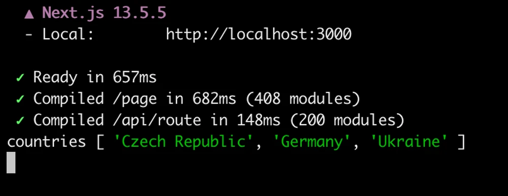
We are also going to need some way to test if the input works, so let’s create an API endpoint (a Route Handler) that will read all the selected countries from the submitted form and print them to the server logs.
To do that, we will create another folder in the src/app directory called api and then create a route.js file inside.
In this file we are going to export an async function called POST that will read the form data from the request, getAll the countries from the form data, and print them out:
// src/app/api/route.js

export async function POST(request) {
  const formData = await request.formData();
  const countries = formData.getAll("countries");

  console.debug("countries", countries);

  return new Response("All good", { status: 200 });
}
We also need to make sure that the form is submitted to this endpoint, so let’s add action="/api" and method="post" to our form tag:
// src/app/page.js

// ...

export default function Page() {
  return (
    <>
      <h1>{"Multi-Select Dropdown"}</h1>
      <form action="/api" method="post">
        <MultiSelectDropdown formFieldName={"countries"} options={COUNTRIES} />
        <input type="submit" />
      </form>
    </>
  );
}
Now, when you go to the dropdown, select a couple of countries, and click “Submit”, you should be able to see the list of the countries that you have selected in the server logs:

Handling changes
Let’s also make sure that there’s a way to inform the parent component about the changes in the selection by introducing an onChange prop and calling this function whenever the state of any checkbox changes.
Since onChange is an event handler and we are using Next.js with all the SSR and SSG quirks, we are also going to need to add a "use client" directive at the top.
We are also going to need the selectedOptions state to keep track of what the user has already selected:
// src/components/MultiSelectDropdown.jsx

"use client";

import { useState } from "react";

export default function MultiSelectDropdown({
  formFieldName,
  options,
  onChange,
}) {
  const [selectedOptions, setSelectedOptions] = useState([]);

  // ...
}
Then, every time any input is checked or unchecked, we need to update the selectedOptions accordingly and call the onChange callback:
// src/components/MultiSelectDropdown.jsx

// ...

const handleChange = (e) => {
  const isChecked = e.target.checked;
  const option = e.target.value;

  const selectedOptionSet = new Set(selectedOptions);

  if (isChecked) {
    selectedOptionSet.add(option);
  } else {
    selectedOptionSet.delete(option);
  }

  const newSelectedOptions = Array.from(selectedOptionSet);

  setSelectedOptions(newSelectedOptions);
  onChange(newSelectedOptions);
};

// ...
Do not forget to pass the handleChange function as onChange handler to every input that is rendered:
// src/components/MultiSelectDropdown.jsx

// ...

options.map((option, i) => {
  return (
    <li key={option}>
      <label className="flex whitespace-nowrap cursor-pointer px-2 py-1 transition-colors hover:bg-blue-100 [&:has(input:checked)]:bg-blue-200">
        <input
          type="checkbox"
          name={formFieldName}
          value={option}
          className="cursor-pointer"
          onChange={handleChange}
        />
        <span className="ml-1">{option}</span>
      </label>
    </li>
  );
})

// ...
And let’s pass a debugger function to the component instance so that we can test that it works:
{/* src/app/page.js */}

{/* ... */}

<MultiSelectDropdown
  formFieldName={"countries"}
  options={COUNTRIES}
  onChange={(selectedCountries) => {
    console.debug("selectedCountries", selectedCountries);
  }}
/>

{/* ... */}
Now the array of selected options should be printed out every time the selection changes:
Select all and Clear selection
It would be also nice to add some helper buttons for the user to be able to quickly select all the options and to quickly reset the selection.
To progressively show the buttons only when JavaScript is enabled, we need to introduce a state value that will be initially false but on the initialization of the component will become true. I am going to call it isJsEnabled and will set it to true in a useEffect hook.
Also, this would be a good time to introduce such derived variables as isSelectAllEnabled and isClearSelectionEnabled which will help us to enable or disable the according buttons. The former will be true unless the number of selected items is the same as the number of all available options. The latter will be true if the number of selected items is greater than zero.
// src/components/MultiSelectDropdown.jsx

"use client";

import { useState, useEffect } from "react";

export default function MultiSelectDropdown({
  formFieldName,
  options,
  onChange
}) {
  const [isJsEnabled, setIsJsEnabled] = useState(false);
  const [selectedOptions, setSelectedOptions] = useState([]);

  useEffect(() => {
    setIsJsEnabled(true);
  }, []);

  const isSelectAllEnabled = selectedOptions.length < options.length;
  const isClearSelectionEnabled = selectedOptions.length > 0;

  // ...
}
Since the inputs are uncontrolled, we are going to need a way to find all the inputs and update the checked attribute. To do that, I am going to introduce a ref that would store the pointer to the options list DOM element:
// src/components/MultiSelectDropdown.jsx

"use client";

import { useState, useEffect, useRef } from "react";

export default function MultiSelectDropdown({
  formFieldName,
  options,
  onChange
}) {
  // ...

  const optionsListRef = useRef(null);

  // ...

  return (
    <label className="relative">
      {/* ... */}

      <div className="absolute bg-white border transition-opacity opacity-0 pointer-events-none peer-checked:opacity-100 peer-checked:pointer-events-auto">
        {/* ... */}
        <ul ref={optionsListRef}>
          {options.map((option, i) => {/* ... */}
        </ul>
      </div>
    </label>
  );
}
Now we can write the two helper functions that would go through all the inputs inside of the optionsListRef, update the checked attribute, update the selectedOptions state, and call the onChange callback:
// src/components/MultiSelectDropdown.jsx

// ...

export default function MultiSelectDropdown({
  formFieldName,
  options,
  onChange
}) {
  // ...

	const handleSelectAllClick = (e) => {
	  e.preventDefault();

	  const optionsInputs = optionsListRef.current.querySelectorAll("input");
	  optionsInputs.forEach((input) => {
	    input.checked = true;
	  });

	  setSelectedOptions([...options]);
	  onChange([...options]);
	};

	const handleClearSelectionClick = (e) => {
	  e.preventDefault();

	  const optionsInputs = optionsListRef.current.querySelectorAll("input");
	  optionsInputs.forEach((input) => {
	    input.checked = false;
	  });

	  setSelectedOptions([]);
	  onChange([]);
	};

  // ...
}
Do not forget to bind the functions to the according buttons:
{/* src/components/MultiSelectDropdown.jsx */}

{/* ... */}

<ul>
  <li>
    <button
      onClick={handleSelectAllClick}
      disabled={!isSelectAllEnabled}
      className="w-full text-left px-2 py-1 text-blue-600 disabled:opacity-50"
    >
      {"Select All"}
    </button>
  </li>
  <li>
    <button
      onClick={handleClearSelectionClick}
      disabled={!isClearSelectionEnabled}
      className="w-full text-left px-2 py-1 text-blue-600 disabled:opacity-50"
    >
      {"Clear selection"}
    </button>
  </li>
</ul>

{/* ... */}
Now it should be much easier to select all the elements at once or to reset the selection:
And if you disable JavaScript, the buttons won’t show up, but the component will still function:
Wrapping up
That was a lot. I won’t be adding the polishing steps here, you can check them out here and here.
I would also like to point out that the form action attribute is not the usual way to handle form submissions in Next.js. It is used in this post just to demonstrate that it is possible to implement such a component without using browser JavaScript. The recommended ways to submit forms via Next.js are Server Actions or the plain old Fetch API.
Feedback
Full source code is available in a GitHub repository. If you have any feedback, please feel free to submit an issue.